

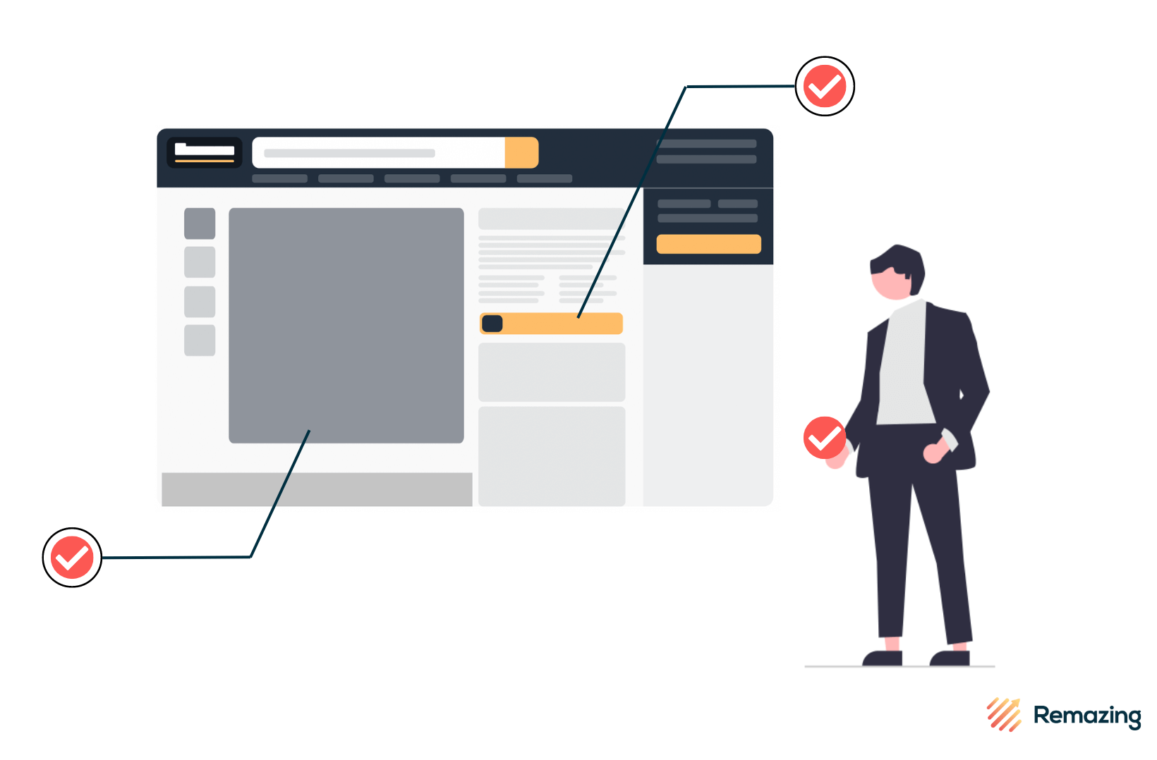
Best Practice: Our 10 Favourite Product Optimisations on Amazon

As a full service Amazon Agency, we spend a lot of time analysing, creating, reviewing, and editing Amazon Product Detail Pages (PDPs). What’s been clear for several years now is that optimised content for Amazon listings helps to not only increase sales and conversion but also to build brand trust and showcase the platform as a “second home” for many brands.

It’s evident therefore that investment into e-commerce channels is not only recommended, but in many product categories, necessary in order to keep pace with the changing face of retail. Amazon is now a household name worldwide: The findings from Remazing’s recent International Amazon Shopper Report 2022 underpin how Amazon remains the platform to master in order to take advantage of current consumer attitudes and behaviours:
- 98% of surveyed consumers say they have heard of Amazon, with 89% having ordered from the marketplace at least once.
- Amazon’s potential as more than just a sales platform is emphasised by growing numbers of people using Amazon to compare product prices, and to look at relevant reviews.
- 66% of online shoppers say they start their journey for a particular product via Amazon rather than via Google.
Leveraging the enormous popularity of Amazon isn’t possible without making best use of the tool kit that the e-commerce giant offers its vendors and sellers: SEO, Gallery Images, Enhanced A+ Content, Amazon Brand Stores, and more recently, Brand Stories. That’s why it’s worth highlighting a few Amazon case studies of brands and products that have particularly strong optimisations. Often there are some crucial lessons and principles that brands can take from these examples to improve their own Amazon presence.
With millions upon millions of products available across a multitude of Amazon marketplaces, it’s not easy to choose just ten, but here are some of our best practice favourites, mainly from Amazon UK with a few borrowed EU market examples!
Optimised Amazon Text (SEO)
Optimised Amazon SEO is perhaps the most crucial aspect for any product on Amazon. Often it has to inform, explain, and educate the shopper on a product with just a few strands of text. At the same time, it has to be balanced with Amazon SEO principles, as this helps improve Amazon ranking with respect to search results. This is done chiefly by ensuring all product copy has localised and relevant keywords that will be indexed by the Amazon search algorithm.
NIVEA Pearl & Beauty Anti-Perspirant Deodorant Spray
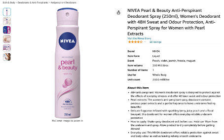
As Amazon SEO principles are often quite different to those found in Google SEO, it isn’t best practice to simply duplicate across existing webshop or other e-retail platform copy. Amazon SEO has to be built from the ground up! That’s why this NIVEA example stands out to us: The product title may appear to be longer than what you may find on NIVEA’s website – but contained within it is all the information needed to make an informed purchase decision: Intended customer, format, quantity size, scent. All of this information is neatly worded to utilise common Amazon shopper search queries as high-ranking product keywords: such as “Women’s Deodorant”, “Anti-Perspirant Spray”, and “Deodorant Spray”.
Elsewhere, the bullets below contain more product benefits and relevant application information, allowing the shopper to have a thorough understanding of the product without needing a further page scroll or being overwhelmed by excessive copy.
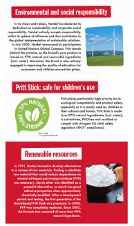
Elastoplast Waterproof XXL Med+ Dressings
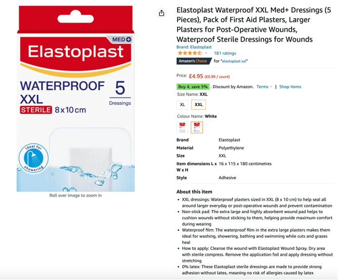
Elastoplast Waterproof XXL Med+ Dressings
Another strong example comes from Elastoplast. Here there are a few more technical aspects to account for in the copy: Namely, information around product quantity (important so customers can gauge relative value), sizing (which is particularly important when the consumer has a choice of product variation on the page), and the 0% latex constitution (relevant for allergies).
Looking closer at the text and choice of phrases, it’s again possible to identify the most important keywords that will most likely be crawled by Amazon’s search algorithm first: “First Aid Plasters” in the title for instance, as well as “Waterproof plasters” and “sterile dressings” in the product’s bullet points are all likely to be common phrases entered by consumers into the search bar.
Optimised Amazon Gallery Images
Text only tells half the story when it comes to an Amazon Product Detail Page as, in our opinion, images can speak far more directly to a potential shopper. This is why it’s crucial to make sure that the accompanying images and videos for a product not only explain what it is, but how it can be used, and what accompanies it. This is especially important for customers who are shopping via their mobile devices, as gallery images are even more prominent compared to the text elements of your PDP.
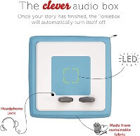
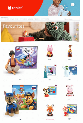
tonies Toniebox Bundle
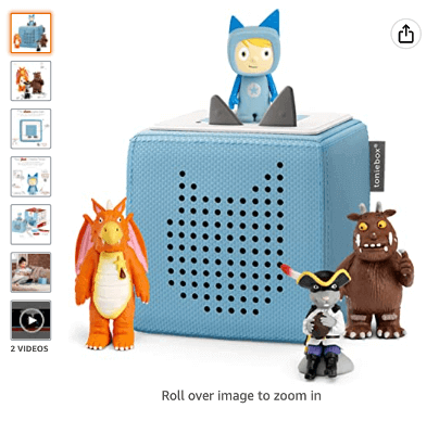
Communicating all this information can be quite challenging given Amazon’s guidelines governing what can and can’t be present in gallery images. Better content examples, such as this one from tonies, understand how to work within Amazon’s limitations, and help their native branding shine through.
For example, Amazon insists that the “main” (first) image must be just the product set against a plain white background, with no opportunity to input the brand’s corporate identity (CI) or additional text. The brand tonies, therefore uses the very next image to not only spotlight the figurines included in this bundle (i.e what makes it distinct from other toniebox bundles), but inject some subtle CI elements which fit with the product’s forest theme.
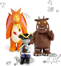
Additionally, a handy branded image helps summarise what unique selling point the toniebox has, without being crowded with too much text. The result is an easy to understand product gallery that “passes the eye test” at first glance, while spotlighting some of the more difficult-to-describe benefits that may be absent from the written copy.
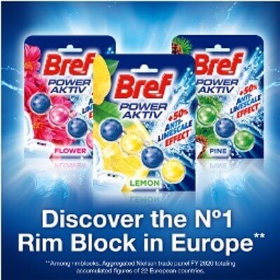
Bref Power Aktiv
As established above, more minimalist images, embellished with a brand’s CI can really make a product’s detail page stand out. But it’s also worth looking at how optimising images on Amazon can be used to show the specifics of the product, as well as enable easier comparisons. For many shoppers, the benefits of the product cannot be expressed just as lines of copy, but require illustration. This example from the Bref Power Aktiv range helps provide a visual comparison so consumers are left in no doubt as to what results they can expect.
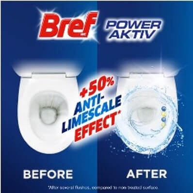
Many brands can also take Amazon’s approach to marketing claims in images for granted, as Amazon’s content guidelines are notoriously strict on documenting and supporting claims regarding effectiveness. Where some brands fall down regarding these regulations is in simply reusing images which have been used on the company website or other e-commerce marketplaces. Sometimes the supporting claim for these images is contained elsewhere on the page, but with Amazon imagery, it’s best to ensure that top class visual assets are supported by legible, clear claims integrated into the image itself such as the claim here for being the number 1 Rim Block in Europe.
Enhanced Amazon A+ Content
Although A+ content is located at the lower part of your product detail page, it is more prominent and visible on mobile devices, where people are increasingly doing their online shopping. This is why we recommend brands opt for Premium A+. This gives you the option to use multiple modules containing richer elements such as banner imagery and cross-selling tables. Whilst your A+ page will not directly contribute to your Amazon ranking, it’s the perfect place to highlight lengthier product benefits – without some of the limits of Amazon’s SEO content fields. Whereas the SEO sections of product detail pages are uniformly present across Amazon, you can effectively tailor your A+ content to give your PDP a look and feel that better represents your brand, your way!
SEVERIN Egg Cooker
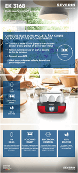
As demonstrated in this example from SEVERIN, a basic A+ template can be used to great effect to display key information and product benefits. SEVERIN have used multiple banner modules in their company CI, and organised them with cohesive background imagery, in a “one-pager” format. This gives their content a personalised, landing page feel. Additionally, they have used layered text in their own brand fonts and colours to highlight USPs which convey a more high-end, “luxurious” feel, rather than using the text boxes offered by the A+ builder, in Amazon CI. Using your A+ to convey your brand’s identity in this style is more likely to convince shoppers the product offered comes directly from the brand, and can help drive sales.
Subscribe to our newsletter now and receive regular updates on Amazon and other online marketplaces.
Subscribe to the newsletter now.
Loctite Brush On Superglue
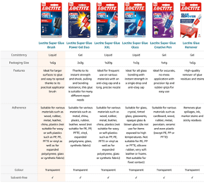
Similarly, Loctite’s Brush On Superglue example leverages one of the most important modules for any A+ page, basic or premium: the cross-selling table module. Cross-selling tables are a really useful way of highlighting key information about your best-selling products, as well as up- and cross-selling complimentary items and accessories to increase average order size. These items are also clickable with a direct link leading to the product’s PDP.
This provides the shopper with a high-quality experience and gives them a deeper awareness of your products and brand as a whole.
It’s important to think about what information you want to include in your cross-selling table. Loctite have carefully selected 5 additional products from their range and chosen to have sections dedicated to “Features” and “Consistency”. This allows them to define what makes each item unique and ensures shoppers find the perfect fit for them. The customer is then likely to get a better user experience and trust Loctite for their future adhesive needs.
Schwarzkopf got2b gotcurlz, Beach Waves Hydrating Hair Spray
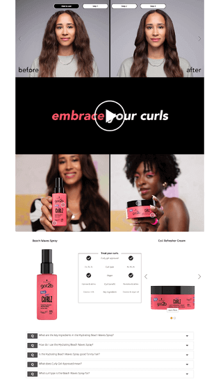
Schwarzkopf have access to Amazon’s A+ premium offering. This means access to additional module types which allow for videos, more interactive images, as well as an FAQ section. Schwarzkopf’s result is an outstanding, interactive, and engaging shopping experience which lets shoppers discover product features on their own.
The FAQ section, located at the bottom of this example, is a great place to provide any preemptive answers to questions that customers regularly ask about your product. Having these in place will decrease return rates and bad reviews, as shoppers will be fully informed before they make a purchase. It’s also an opportunity to demystify any of the techy or industry-specific language you’ve used elsewhere in your SEO. For example, Schwarzkopf have chosen to include “What does Curly Girl approved mean?”, which means they do not have to use up character count explaining this in detail elsewhere on their PDP.
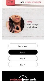
In the “How to Use” carousel module, we can scroll through steps 1 to 3 on desktop, but A+ Premium also enables the option to optimise your module for mobile formats. Schwarzkopf have created a step guide for the mobile version of their A+ content. This ensures that all shoppers have a high-quality experience, whatever device they are using to browse Amazon. In the UK alone, for instance, our Amazon Shopper Report for 2022 showed that nearly twice as many shoppers were accessing Amazon via their mobile, compared to on desktop. As ever larger percentages of shoppers make purchases on mobile devices, it is crucial to consider how your PDP will display on mobile.
Optimised Amazon Brand Stores
When shoppers search for products on Amazon, even if they type your specific brand into the search bar, your competitors can appear in the results. An Amazon Brand Store is one of the few places within Amazon where shoppers will only see your products and can browse through your whole catalogue. Additionally, they can often be a landing page for any Sponsored Ads you may be running as part of your Amazon Advertising activities.
Pritt Store Page
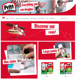
Brand Stores can quickly become overwhelming to many shoppers, which is why you want to ensure that your store is easy to navigate. Facilitating easy and logical store navigation can help boost cross-selling and really showcase what makes your brand unique.
Pritt use their distinctive red branding as a background for their image and banner modules to create an immediate sense of ownership on their store page. The text is limited and this helps keep their language clear and concise.
Pritt also include an ‘About Us’ page in their store. This is an opportunity for them to showcase their brand identity, demonstrate examples of their CSR involvement, and explain their heritage/competencies. In this space, you can connect to shoppers by providing them with more “personal” stories, or even using branded content such as the DIY videos Pritt have produced to give subtle suggestion of product usage. Making the most of opportunities for richer content like this will set your brand apart from competitors on Amazon, and further your brand’s presence on the platform.
tonies Store Page
When building your store page, you need to consider how you are going to separate your products into their respective sections. Depending on how large your catalogue is, you need to decide which product groups will effectively guide your customers through their shopping journey. Your chosen sections will then appear along the top bar of your page, below your banner logo, as you can see in this example from tonies.
As part of your business’ Amazon strategy, you might want to dedicate one section of your store page to “Bestsellers” or, in this case, ‘“Favourites” (Amazon even have a module which automatically selects your best-selling products based on sales data, but you can always showcase your products manually if you prefer). There are a few reasons to consider including a page dedicated to your best-selling products: Firstly, it signals to customers that your items are in high demand. So, it gives someone who is new to the brand an intro to the brand and the “flagship” products that are likely to be more popular with fellow shoppers.
Optimised Amazon Brand Story
One of the more recent developments when it comes to Amazon content, Brand Stories are navigable tiles which provide a space for companies to engage with shoppers through interactive content that helps explain the brand’s purpose and heritage. This banner-style content is located just above your regular A+, so is even more likely to be seen by shoppers.
NIVEA SKiNGUiDE Brand Story
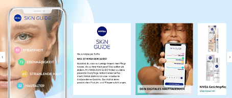
While products can be displayed in a Brand Story, the information that can be displayed alongside them is minimalist due to a limited module choice, so it’s best to focus on the brand. It’s best for a Seller/Vendor to use one Brand Story per brand, but it doesn’t have to be applied to every single product listed under a given brand. This means more creative brands are taking advantage of the module to highlight new and exciting innovations that might be applicable to multiple products.
One such innovation is NIVEA’s SKiN GUiDE, which enables users to get customised product suggestions simply by taking a selfie. It’s highlighted here on a NIVEA Germany ASIN on Amazon.de, and appears across a number of their products which are likely to be recommended by the SKiN GUiDE. These same products are shown further along in the Brand Story, whilst other tiles explain the function of the app.
Conclusion
As these examples help demonstrate, there is a multitude of ways to optimise your brand’s Amazon content and ensure you are making the most of the tools the platform has to offer. Our Amazon Shopper Report 2022 helped highlight just how big Amazon is compared to many other e-retailers. The takeaway for us is clear; if your brand is selling on Amazon, you want to make sure it’s making best use of the Amazon content tools available. Putting time and effort into your Amazon PDPs and stores is crucial if you want to really encourage customers to click that all-important “Add to Basket” button.
Alongside Amazon Advertising, optimisation of Amazon content remains a cornerstone of Amazon agencies such as Remazing, where our 360° approach outlines how outstanding content can lay the foundation for success on Amazon. If you’re looking to optimise your Amazon Content but need some support, Remazing and our team of content experts are here to help. Alongside this, we recommend exploring the platform to see how some of your favourite brands are approaching Amazon. A quick check on how your competitors are optimising their own content can keep you up to date with new developments and potential best practices – if they can do it, you can do it better!
Are you interested in an expert analysis of your Amazon account?
Request free analysisShare this article
Related articles


Remazing GmbH
Brandstwiete 1
20457 Hamburg
©Remazing GmbH
